Here is a simple exercise for you:
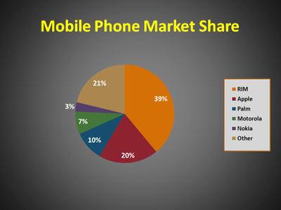
Have a look at this slide, and decide which slice of the pie is the largest. You will probably agree that it is either the red or the orange slice (Apple or RIM). OK, now decide what percentage of the pie Apple and RIM hold.
Of the people that I have shown this slide to, most have guessed that either
- Apple is larger or
- RIM is larger, but not by much
Everybody was surprised to see that RIM (39%) is almost double the size of Apple (20%) – everybody was fooled by the distortion created by the 3D effect on the graph.
Have a look at this slide. Now, it is quite clear that RIM is much bigger. So, when using 3D in your presentations, please have a careful look at the slides and check that you are not distorting the truth.
Note: the above data is not real data – it was just used to illustrate my point.


